COZ · COZINHA CRIATIVA
Rebranding completo de um catering: da brand sprint ao guia de marca, com sistema gráfico construído a partir de um único gesto — o utensílio dentro da letra.A full catering rebrand: from brand sprint to brand guidelines, with a graphic system built from a single gesture — the utensil inside the letterform.


Catering é uma categoria saturada de clichês: talher cruzado, chapéu de chef, tons de vinho. A marca precisava sair do genérico de serviço de alimentação e assumir o que o nome já dizia — cozinha criativa — com um sistema que qualquer pessoa da operação conseguisse aplicar sem quebrar.Catering is a category saturated with clichés: crossed cutlery, chef's hat, burgundy tones. The brand had to leave generic food-service territory and own what the name already said — creative kitchen — with a system anyone in operations could apply without breaking it.
A brand sprint definiu o arquétipo do Amante — atração, prazer, sofisticação. Traduzi isso em um gesto só: o utensílio mora dentro da letra. A colher desenha o vazio do C, o primor ocupa o O, o Z corta em diagonal como uma faca. Desse gesto sai tudo — patterns, grafismo da flor de açafrão, máscara sépia sobre a fotografia. Nada é ornamento: cada elemento é o logotipo em outra escala.The brand sprint set the Lover archetype — attraction, pleasure, sophistication. I translated it into one gesture: the utensil lives inside the letter. A spoon draws the counter of the C, the primor fills the O, the Z cuts diagonally like a knife. Everything follows — patterns, the saffron-flower device, the sepia mask over photography. Nothing is ornament: each element is the logotype at another scale.
Na COZ, gastronomia é arte, conexão e desejo. Não servimos apenas pratos: criamos experiências que despertam emoções e elevam eventos a outro patamar. Nossa cozinha é feita para ser sentida, vivida e lembrada.At COZ, gastronomy is art, connection and desire. We don’t just serve dishes: we create experiences that stir emotion and lift events to another level. Our kitchen is made to be felt, lived and remembered.
Criar conexões e marcar momentos através da gastronomia — transformar o simples ato de comer em um instante de prazer, uma lembrança marcante, um elo entre marcas e pessoas.To create connections and mark moments through gastronomy — turning the simple act of eating into a moment of pleasure, a lasting memory, a link between brands and people.
Palavra-chave: atração. Valoriza a indulgência, a sofisticação e a criação de momentos inesquecíveis pelos sabores — cada detalhe pensado para nutrir corpo e alma.Keyword: attraction. It values indulgence, sophistication and the making of unforgettable moments through flavour — every detail designed to nourish body and soul.
Narrativa envolvente, sem exagero.Engaging narrative, never overblown.
Refinado, sem arrogância.Refined, without arrogance.
Fala como quem entende a dor do cliente.Speaks as someone who knows the client’s problem.
Sem clichê e sem superlativo vazio.No clichés, no empty superlatives.
A estrela de quatro pontas que ocupa o O não pertence só à COZ: o primor é o grafismo que faz a sinergia entre todas as marcas do grupo HBP. Cada marca do grupo o carrega à sua maneira — aqui ele entra no vazio da letra, como o brilho que sobra de um prato bem executado.The four-pointed star inside the O does not belong to COZ alone: the primor is the device that creates synergy across every brand in the HBP group. Each brand carries it in its own way — here it enters the counter of the letter, like the shine left by a well-executed dish.


#FEA501
#DECCA7
#47381F
#F2E8D7
#84264B
#4A3DCA
#FF683B
#5B931F
O sistema de cores não é canônico: é homenagem ao repertório da cozinha. Cada tom leva o nome do que evoca — açafrão, berinjela, pitanga, sépia olfativo, bege tato — para que a escolha seja feita por sensação, não por matiz.The colour system is not canonical: it is a tribute to the kitchen’s own repertoire. Each tone is named after what it evokes — saffron, aubergine, pitanga, sépia olfativo, bege tato — so the choice is made by sensation, not by hue.
Roc Grotesk
Títulos · extrawide e condensed · base do logotipoDisplay · extrawide and condensed · basis of the logotype
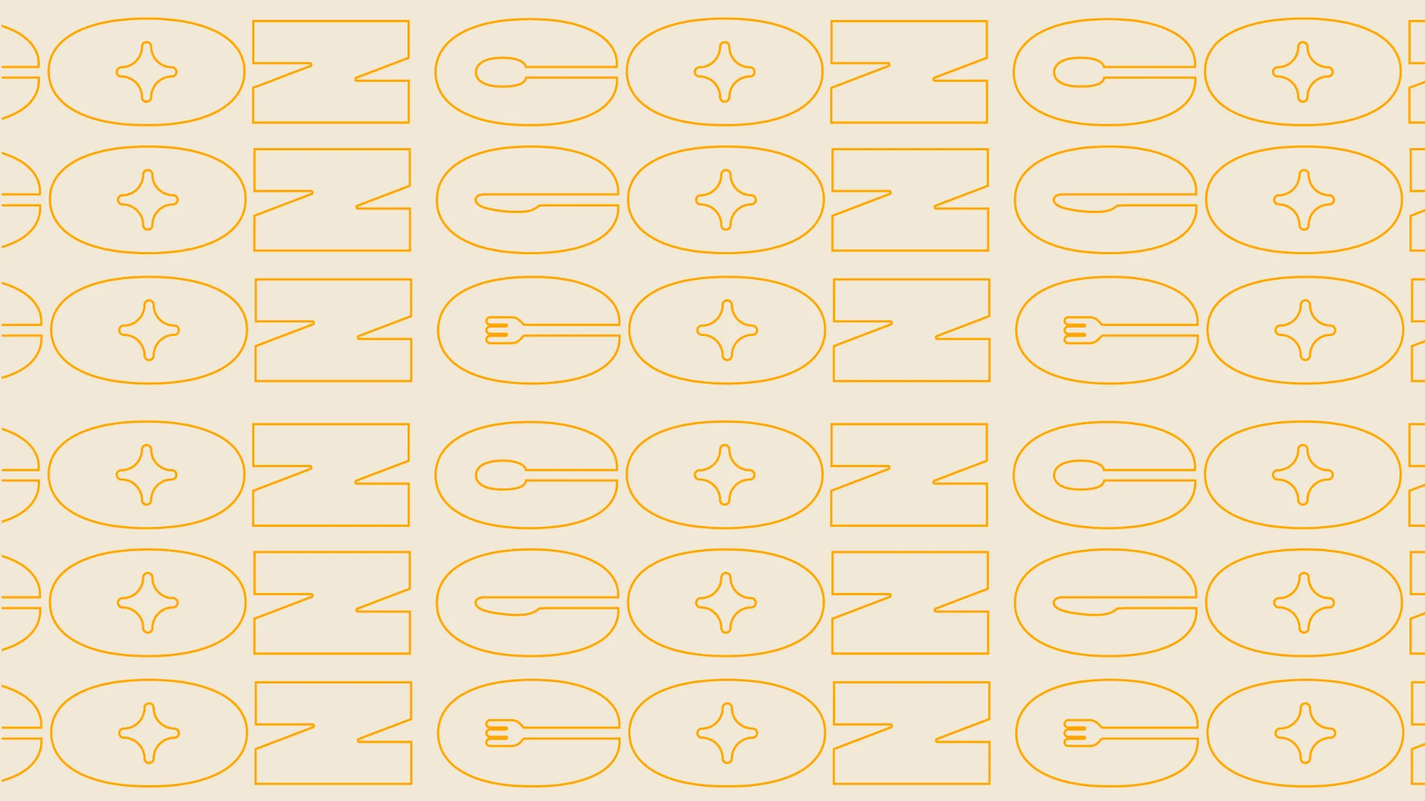



A flor de açafrão — a especiaria que dá nome à cor principal da paleta — expandida em curvas de nível. Funciona como marca d'água, moldura ou textura de fundo, e amarra cor e forma na mesma origem.The saffron flower — the spice that names the palette’s main colour — expanded into contour lines. It works as watermark, frame or background texture, tying colour and form to a single origin.

Um site, um cardápio ou um post só alcançam dois sentidos: visão e audição. O sistema foi construído para convocar os outros três por dentro da imagem — temperatura no lugar do sabor, textura no lugar do tato, luz baixa no lugar do aroma. Daí a paleta nomeada por sentido, e daí o tom editorial: peças que se leem como página de revista, não como anúncio.A website, a menu or a post can only reach two senses: sight and hearing. The system was built to summon the other three from inside the image — temperature standing in for taste, texture for touch, low light for aroma. Hence a palette named after the senses, and hence the editorial tone: pieces that read like a magazine page, not an ad.
Toda peça segue regra de revista: muito ar, alimento em primeiríssimo plano, tipografia como legenda e não como grito. O apetite appeal vem da luz e do corte — nunca de saturação. É o que permite que material de qualidade desigual, de banco de imagem a registro de operação, conviva na mesma página.Every piece follows magazine rules: plenty of air, food in extreme foreground, typography as caption rather than shout. Appetite appeal comes from light and crop — never from saturation. That is what lets uneven material, from stock to on-site coverage, live on the same page.
A receita é documentada no guia camada por camada — #47381F em hue, color e multiply — para que qualquer pessoa reproduza o mesmo resultado sem depender de olho treinado.The recipe is documented layer by layer in the guide — #47381F in hue, color and multiply — so anyone can reproduce the result without a trained eye.
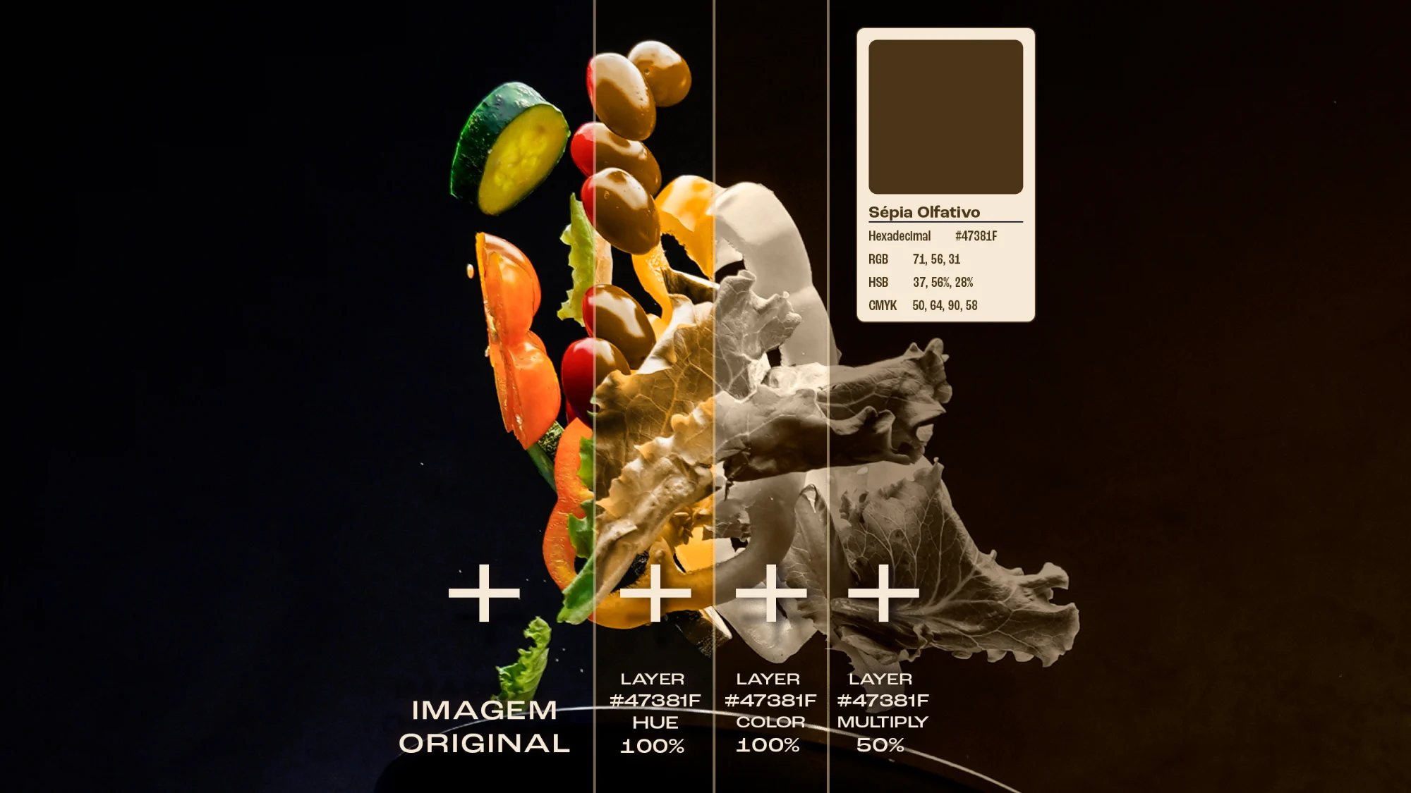
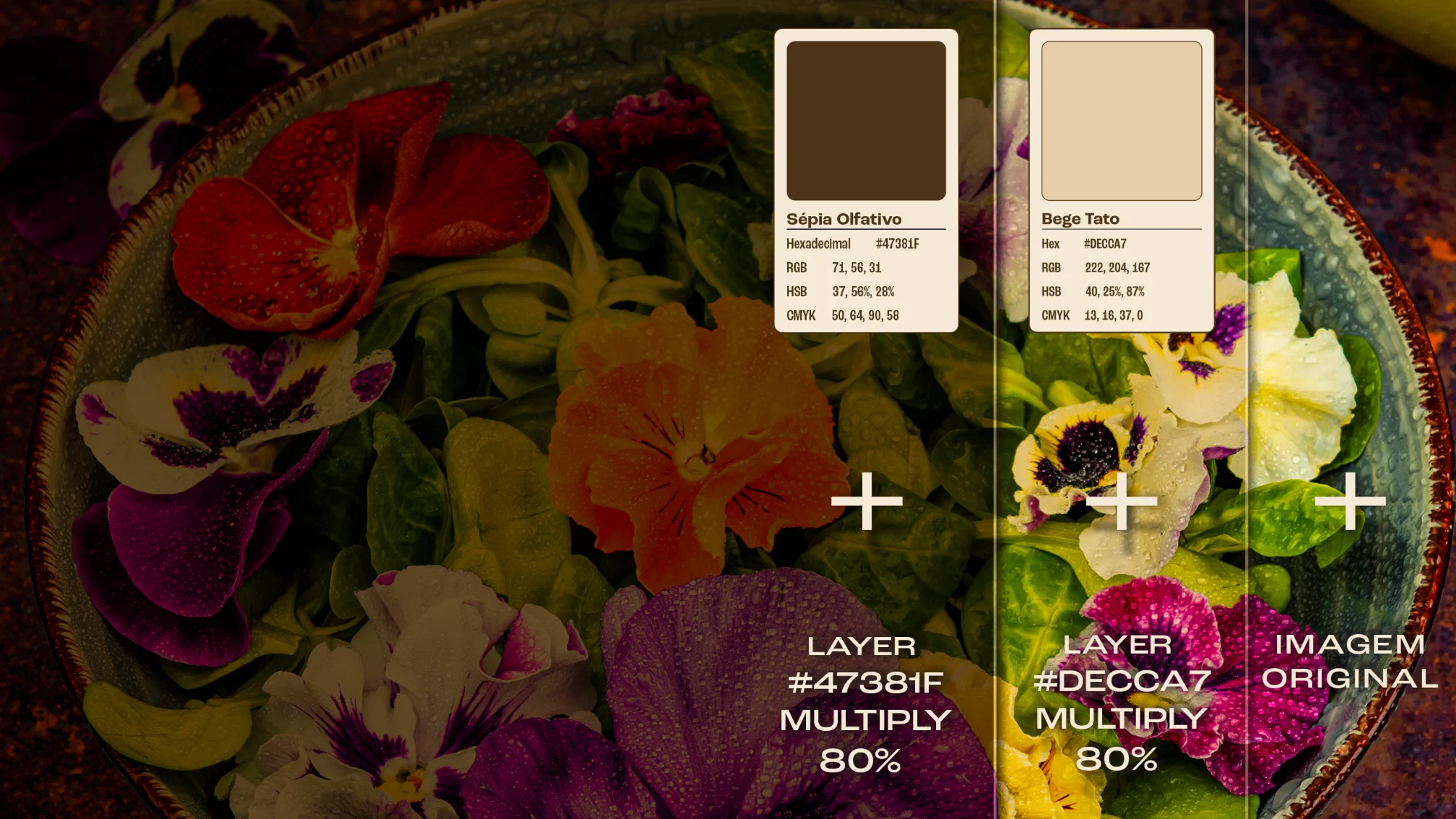
Sépia para o apetite, preto e branco para o gesto: a mesma foto muda de função conforme o que a peça precisa dizer. Vinte fundos em cada versão.Sepia for appetite, black and white for gesture: the same photograph changes function according to what the piece needs to say. Twenty backgrounds in each version.
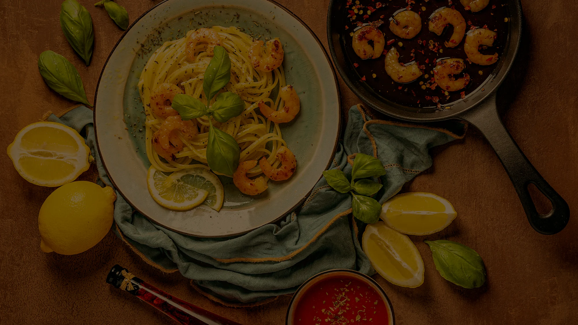
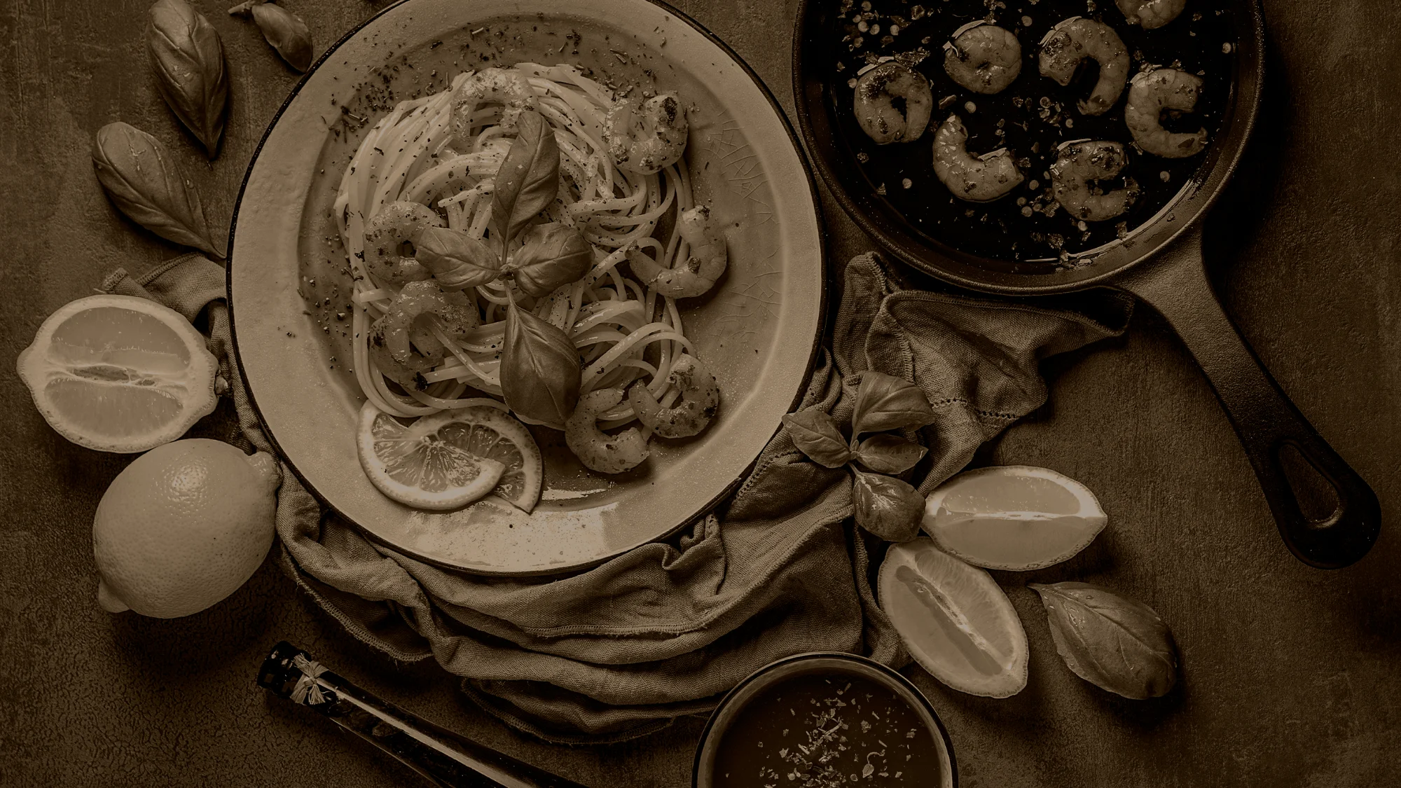

SABORES QUE UNEM, MEMÓRIAS QUE FICAM.FLAVOURS THAT UNITE, MEMORIES THAT STAY.
No mundo corporativo, onde tempo é escasso, a comida é um respiro — uma linguagem universal que conecta pessoas, conta histórias e fortalece laços.In the corporate world, where time is scarce, food is a pause — a universal language that connects people, tells stories and strengthens bonds.
Não servimos apenas comida; criamos conexões, inspiramos ideias e celebramos a singularidade de cada evento.We don’t just serve food; we create connections, spark ideas and celebrate what is singular about each event.
Somos especialistas em sabores e arquitetos de experiências — onde cada ocasião é uma chance de surpreender.We are flavour specialists and architects of experience — where every occasion is a chance to surprise.
Porque o sucesso de um evento não se mede apenas pelo que foi servido, mas pelas memórias que foram criadas.Because an event’s success is measured not only by what was served, but by the memories it created.
Escrevi o roteiro, os direcionais de cena e o lettering do filme manifesto — atmosfera em tons de sépia, textura dos alimentos em primeiro plano, apetite appeal como regra de decupagem.I wrote the script, the shot direction and the lettering for the manifesto film — sepia atmosphere, food texture in the foreground, appetite appeal as the rule of the edit.
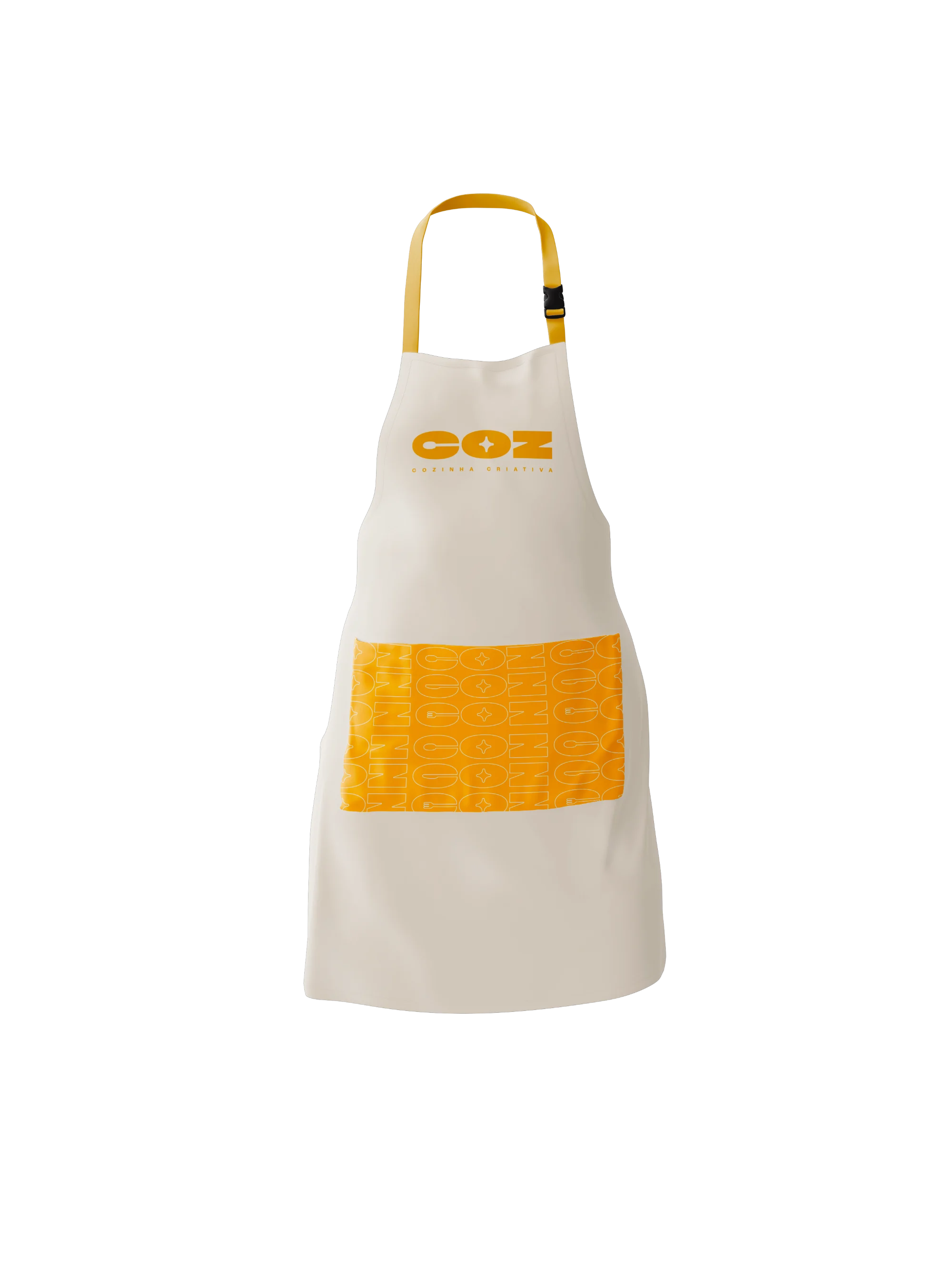
O bolso do avental é onde o pattern aparece — a marca no corpo de quem serve, no único lugar que o convidado vê de perto. Logotipo em açafrão sobre creme, pattern no recorte do bolso: o sistema aplicado com duas cores e nenhuma instrução extra.The apron pocket is where the pattern lands — the brand on the body of whoever serves, in the one place a guest sees up close. Saffron logotype on cream, pattern in the pocket panel: the system applied with two colours and no extra instruction.
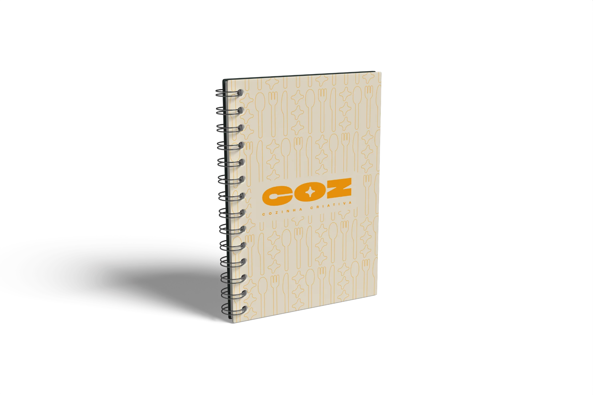

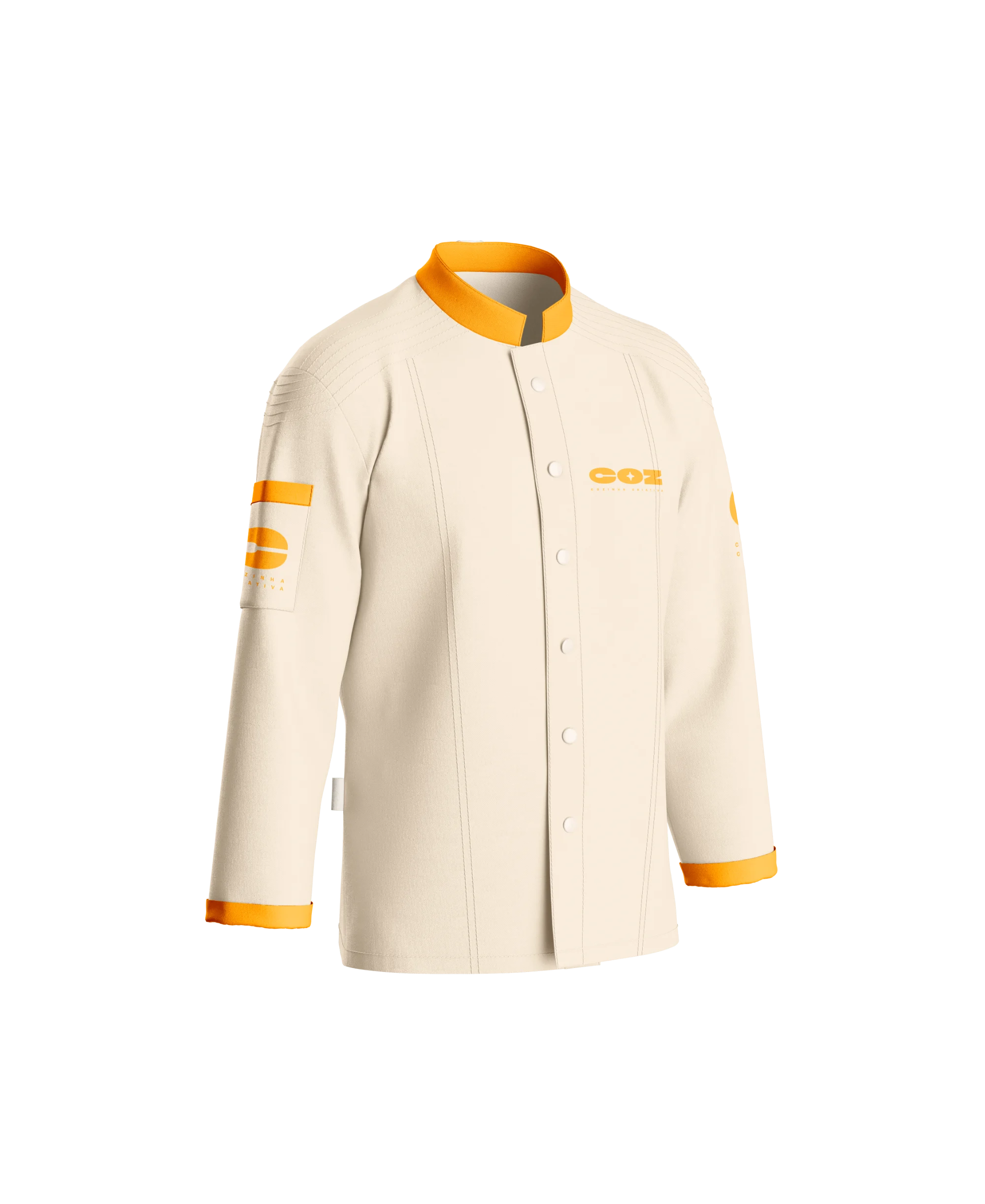
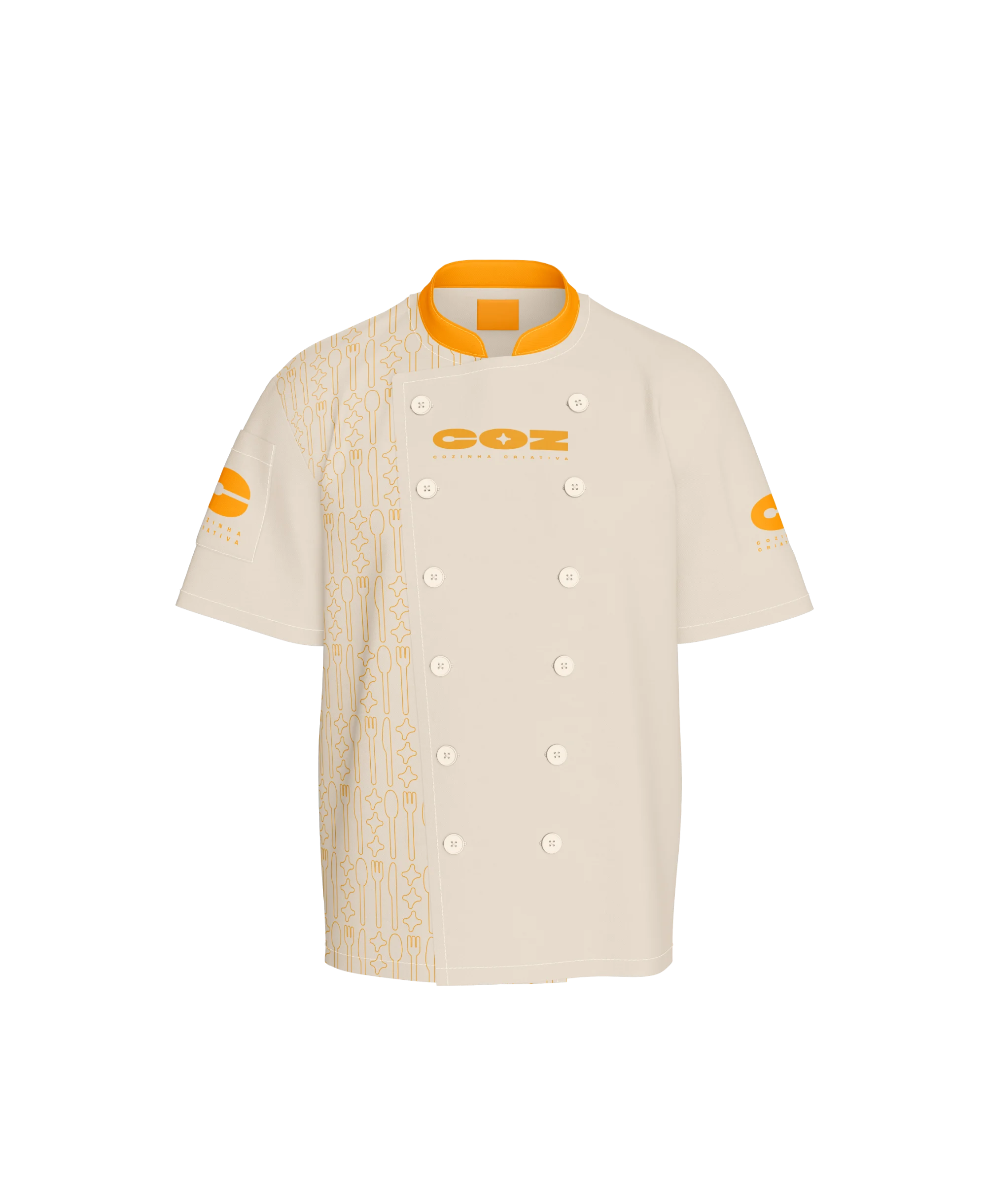
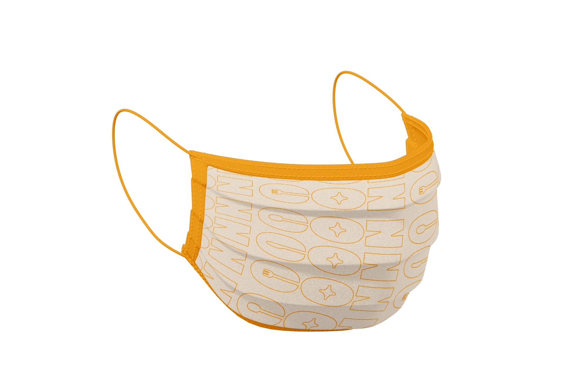
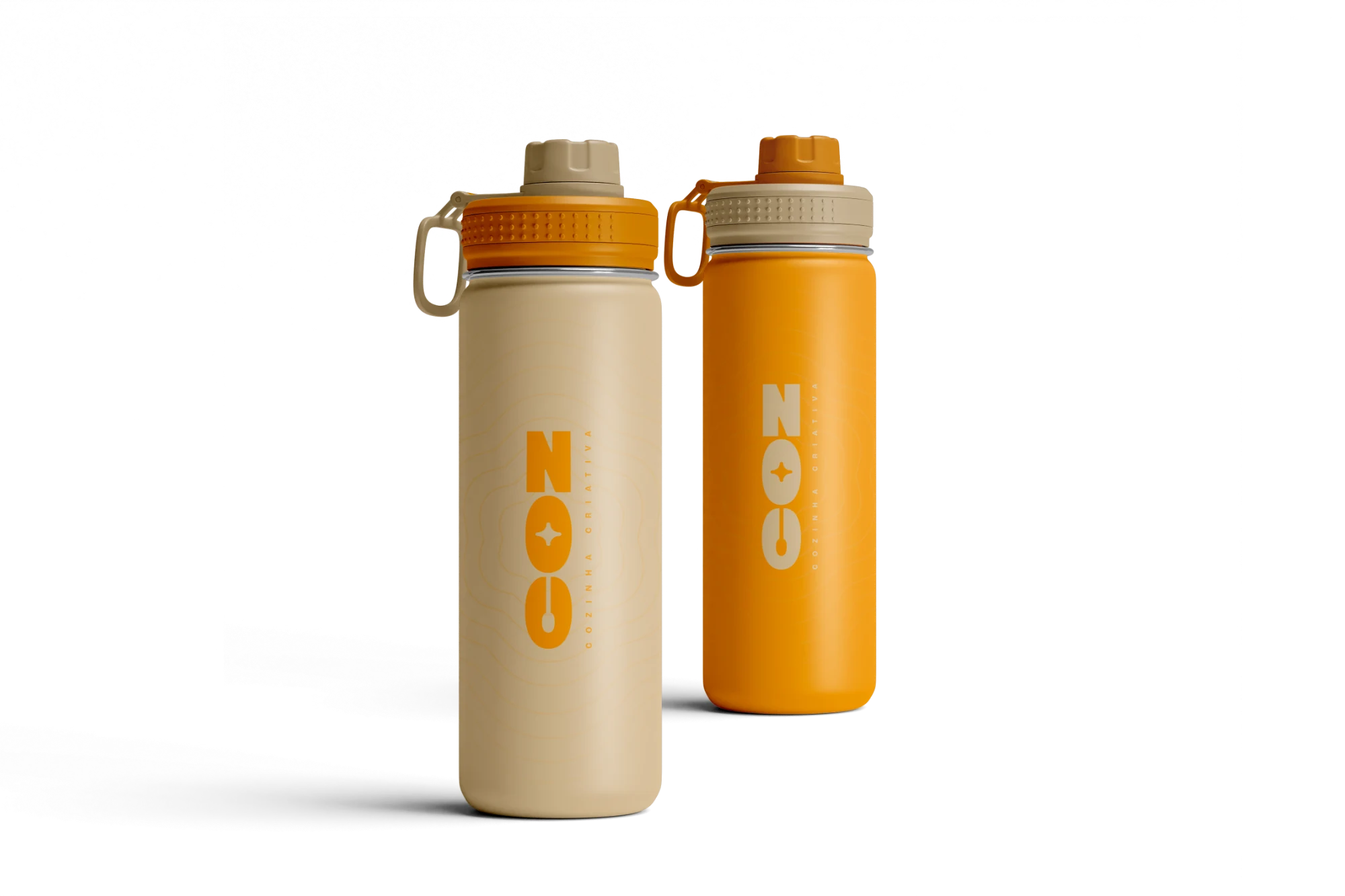

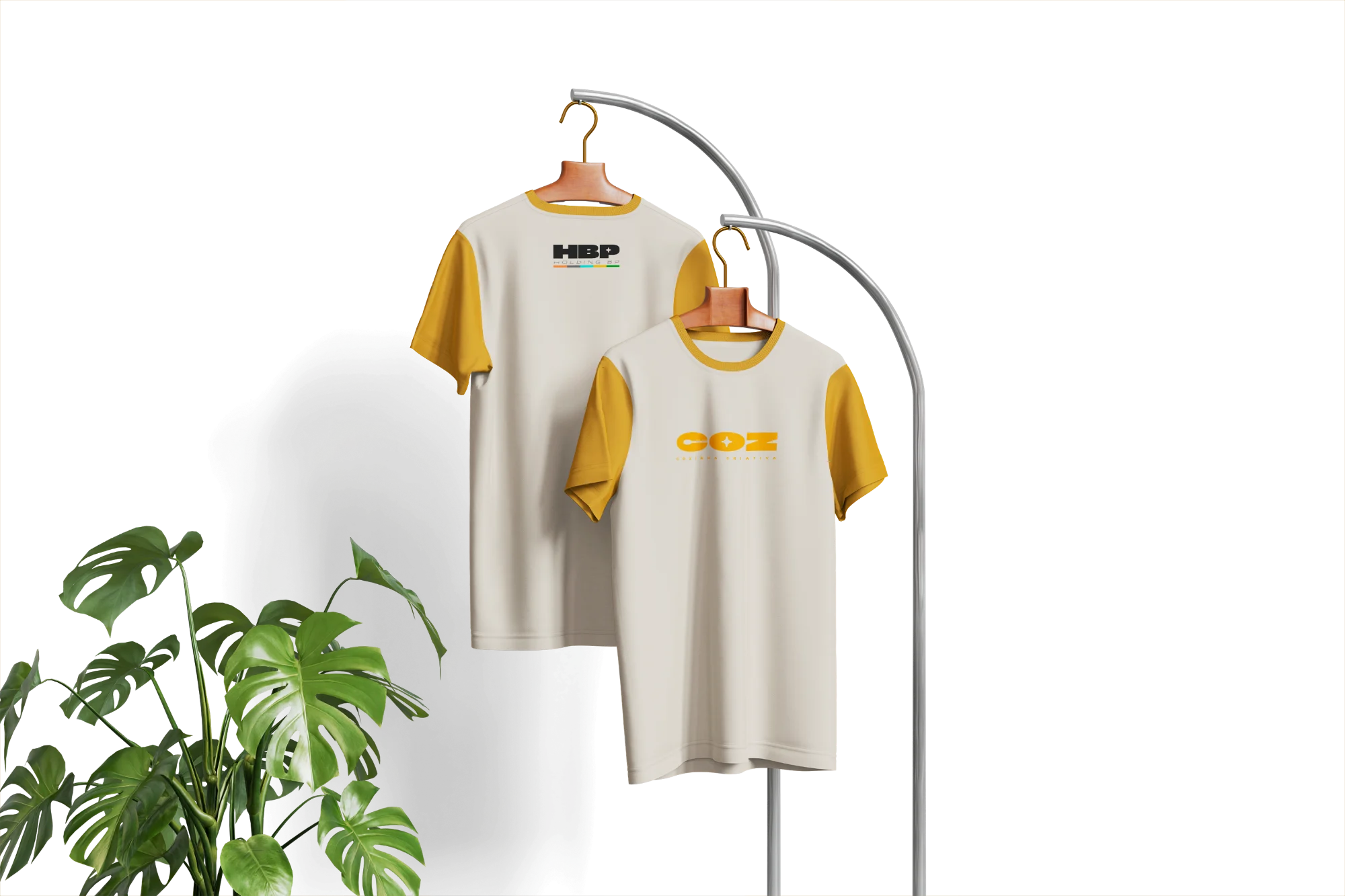
Duas cores por peça. O pattern ocupa recortes — bolso, faixa, painel — nunca a peça inteira. Onde o fundo é açafrão, o logotipo é creme: a mesma marca, sem nenhuma variação nova.Two colours per piece. The pattern lives in panels — pocket, band, front — never the whole garment. Where the ground is saffron, the logotype is cream: the same mark, no new variant.
DA BRAND SPRINT AO AVENTAL: UMA MARCA QUE VENDE PARA PLANILHA E ENTREGA DESEJO.FROM BRAND SPRINT TO APRON: A BRAND THAT SELLS TO A SPREADSHEET AND DELIVERS DESIRE.