#BEPRIME LIVE MKT
A identidade de uma agência de live marketing reconstruída de dentro para fora: mesma paleta oficial, hierarquia invertida. Do refresh de marca ao sistema gráfico, léxico verbal, motion e todas as aplicações internas.The identity of a live-marketing agency rebuilt from the inside out: same official palette, inverted hierarchy. From brand refresh to graphic system, verbal lexicon, motion and every internal application.
A agência entrega energia, festa e movimento — e se comunicava como um comunicado corporativo: fundo bege ou preto, logo no canto, tudo institucional. O briefing interno era claro e restritivo: virar a chave para um visual pop de festival sem inventar uma cor nova. O guide oficial era a âncora, não a limitação.The agency delivers energy, celebration and movement — and communicated like a corporate memo: beige or black grounds, logo in the corner, all institutional. The internal brief was clear and restrictive: switch to a pop, festival-grade look without inventing a single new colour. The official guide was the anchor, not the limit.
Inverti a hierarquia cromática: a cor mais saturada da paleta deixou de ser detalhe e passou a ser o campo inteiro; o neutro virou respiro e texto. O elemento gráfico do manual foi agigantado até se tornar arquitetura da peça. Nada foi acrescentado ao sistema — só recolocado.I inverted the chromatic hierarchy: the most saturated colour in the palette stopped being an accent and became the whole field; the neutral became breathing space and type. The graphic element from the manual was blown up until it became the architecture of the piece. Nothing was added to the system — only repositioned.
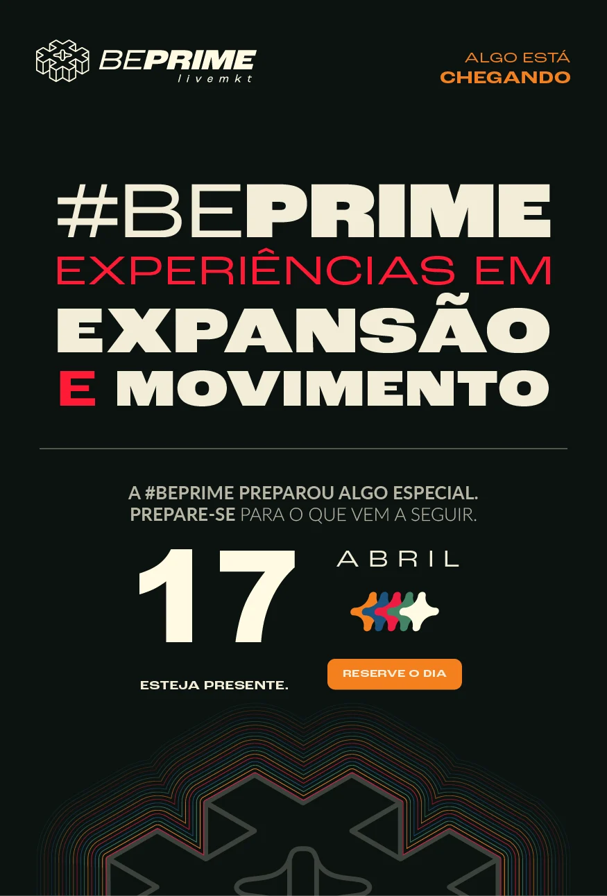

Mesma marca, mesmo manual, mesma agência. A diferença é onde a cor está: antes ela decorava o preto, agora ela é o suporte. Um anúncio de vaga passou a parecer line-up de festival — e é assim que a agência quer ser lida na timeline.Same brand, same manual, same agency. The difference is where the colour sits: it used to decorate the black, now it is the ground. A job ad started reading like a festival line-up — which is how the agency wants to be read in the feed.
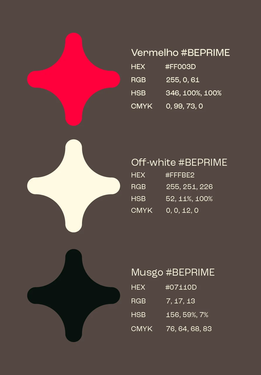
Três cores fecham o sistema — e cada uma sabe funcionar como fundo, como tipo e como grafismo. É o que permite color blocking em saturação máxima sem degradê e sem nenhuma cor de apoio.Three colours close the system — and each one works as ground, as type and as graphic. That is what allows full-saturation colour blocking with no gradients and no support palette.
O grafismo como arquiteturaGraphic as architecture
A estrela de quatro pontas do manual sai da assinatura e ocupa a peça: contorno gigante em conversa com uma versão sólida pequena. Duas escalas, um só elemento — o ritmo nasce da diferença entre elas.The manual's four-point star leaves the signature and takes over the piece: a giant outline in conversation with a small solid version. Two scales, one element — the rhythm comes from the gap between them.



O PREFIXO DA MARCA VIROU VOCABULÁRIO.THE BRAND PREFIX BECAME A VOCABULARY.
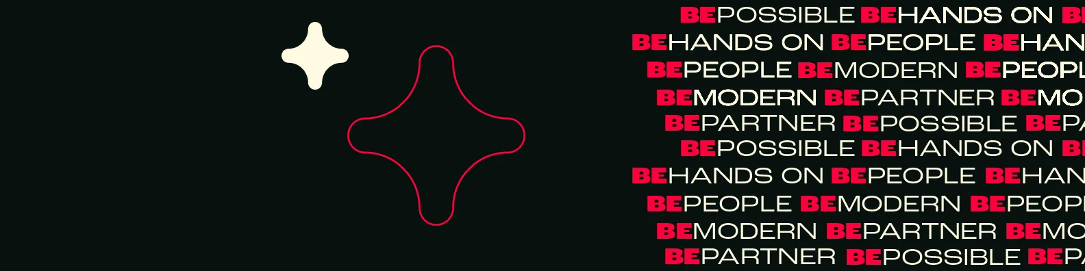
Cada atributo da cultura interna virou uma palavra composta com o próprio nome da agência. Repetidas em trama, elas funcionam como textura — o discurso institucional passa a ser padrão gráfico, não parágrafo.Every attribute of the internal culture became a compound word built on the agency's own name. Repeated as a weave, they work as texture — the institutional discourse becomes graphic pattern rather than paragraph.
A assinatura em movimento fecha o sistema: o mesmo grafismo que estrutura a peça impressa carrega o site e assina os vídeos. Loop curto, sem efeito — a marca se monta e se dissolve na cor.The motion signature closes the system: the same graphic that structures the printed piece loads the site and signs the films. Short loop, no effects — the brand assembles and dissolves into the colour.
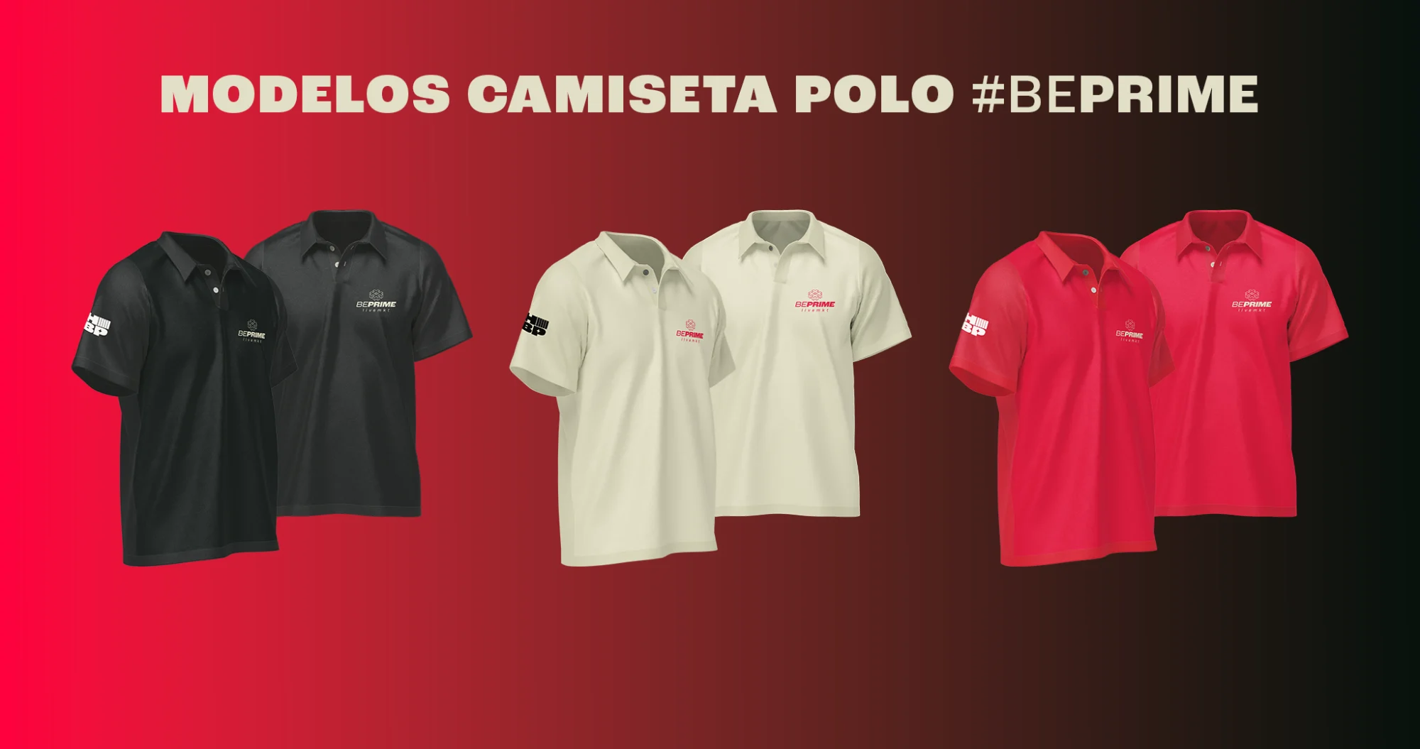
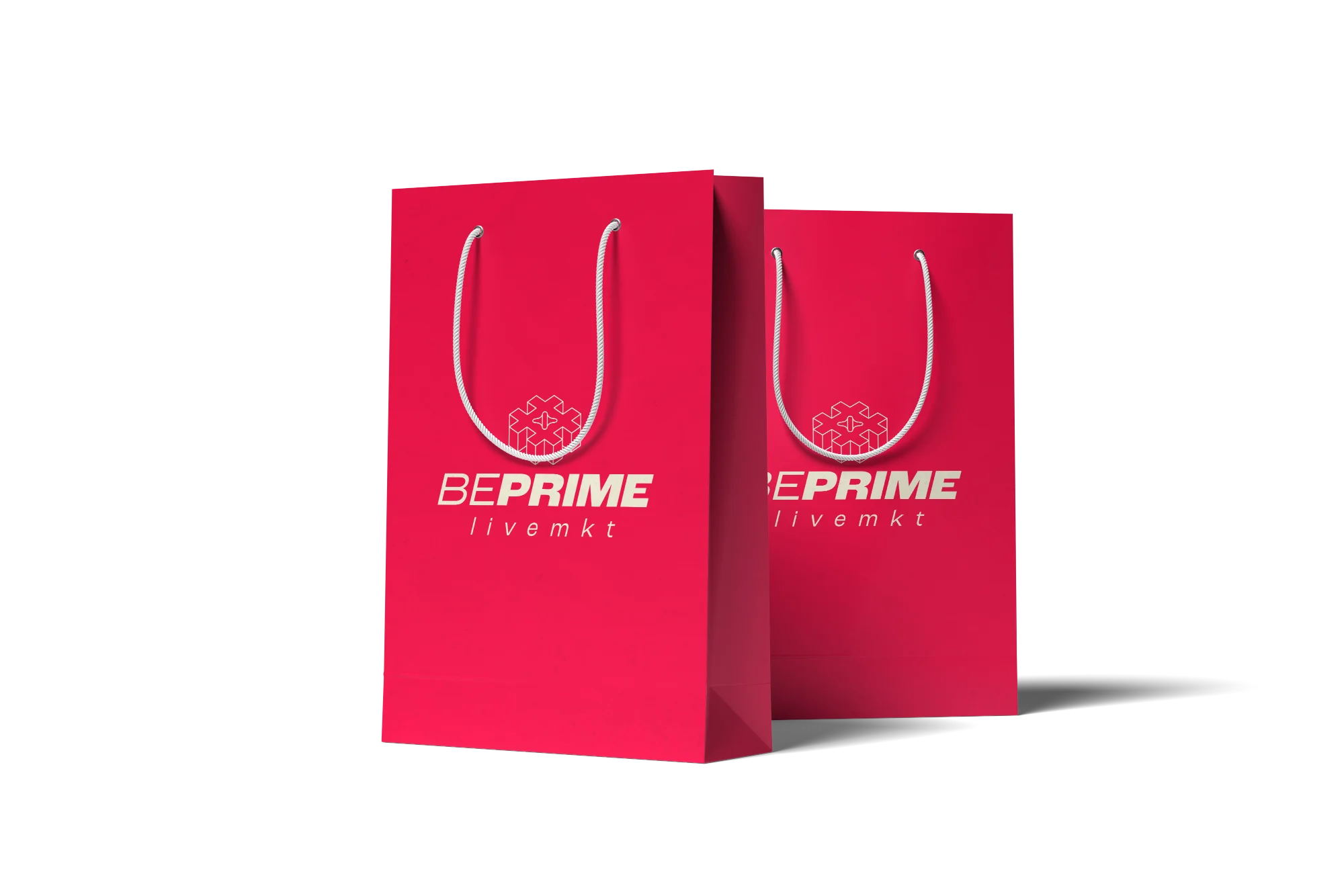
Uma cor por peça como campo, uma como tipo, uma como grafismo — e a rotação entre as três é o que cria variedade. Assim qualquer pessoa do time monta uma peça nova sem pedir arquivo: escolhe o campo e o resto é consequência.One colour per piece as ground, one as type, one as graphic — rotating the three is what creates variety. Anyone on the team can build a new piece without asking for a file: pick the ground and the rest follows.
A MARCA NÃO GANHOU CORES NOVAS. GANHOU CORAGEM DE USAR AS QUE JÁ TINHA.THE BRAND DIDN'T GAIN NEW COLOURS. IT GAINED THE NERVE TO USE THE ONES IT HAD.